 English
  French
  German
  Spanish
  Polish
  Chinese
  Japanese
  Korean
  Russian
 Contents
Answer Excerpt
A logo on custom silicone products should be designed with the product structure, mold process, branding visibility and mass-production consistency in mind. Buyers should not focus only on how the logo looks in artwork. They should also evaluate whether the logo size, position, depth, surface texture and molding method will allow the logo to remain clear, attractive and stable during production. In most projects, clean branding comes from balancing visual identity with manufacturability.
Branding is one of the first things a customer notices on a silicone product.
For OEM buyers, a logo is not just decoration.
It may influence:
- product identity
- retail presentation
- premium appearance
- private-label differentiation
- brand recognition
- mold complexity
- production consistency
Many buyers assume that any logo can simply be “added” to the product.
In reality, logo performance depends on much more than artwork.
A logo that looks good on a screen may become difficult to mold if it is:
- too small
- too shallow
- too deep
- placed on a curved area
- placed near a parting line
- placed on a textured surface
- placed on a flexible deformation area
For B2B buyers, the better question is not only:
Can the logo be molded?
It is:
Can the logo remain clear, attractive and consistent across tooling, sampling and mass production?
Why Does Logo Design Need to Be Considered Early?
In many OEM projects, the logo file is sent late in development.
That often creates avoidable problems.
A silicone product is not like printed paper.
The logo has to work together with:
- product geometry
- mold structure
- material flexibility
- cavity finish
- parting line direction
- demolding behavior
- appearance requirements
If the logo is designed too late, the manufacturer may have limited options.
For example, the team may find that the requested logo position:
- falls on a curved transition
- overlaps a thin wall area
- interrupts a sealing edge
- crosses a texture zone
- or sits too close to the mold split
That is why logo design should be reviewed during custom silicone mold development, not only before packaging or shipment.
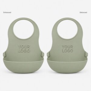
Should the Logo Be Embossed or Debossed?
This is one of the most common questions.
The answer depends on both branding style and product application.
Embossed Logo
An embossed logo rises above the surrounding surface.
It is often chosen when the buyer wants:
- stronger visual presence
- easier touch recognition
- premium retail styling
- a more obvious brand mark
However, embossed logos may be more exposed to abrasion in some applications.
They also need enough structural support to remain clean and well defined.
Debossed Logo
A debossed logo is recessed into the surface.
It is often selected when the buyer wants:
- a cleaner and more subtle appearance
- less protrusion on a contact area
- easier blending into the product surface
- a more understated premium look
Debossed logos are also common on products where a raised feature may interfere with function or cleaning.
Neither option is automatically better.
The right choice depends on the product, the logo style and the expected use condition.
Which Logo Areas Usually Work Best?
A logo should be placed where it can be seen clearly without creating molding difficulty.
In many projects, better locations are:
- flat visible surfaces
- gently curved wide surfaces
- front-facing non-functional areas
- stable wall sections
- thicker support zones
Less ideal locations may include:
- sealing surfaces
- very thin edges
- highly flexible fold lines
- deep texture areas
- sharp corners
- parting-line intersections
- suction zones
- lip-contact zones
- food-contact functional areas where branding should remain unobtrusive
For example, on custom silicone baby bibs, buyers often prefer the logo on the upper front area or lower outer zone rather than inside the food-catching pocket.
On a silicone pet mat, a logo may work better in a corner than in the center of the main use area.
Logo visibility and product function should support each other—not compete.
Why Can Small Logos Become Unclear?
Many brand logos contain fine strokes, small letters and tight spacing.
These details are not always suitable for molded silicone.
A logo may lose clarity if:
- the strokes are too thin
- the letter spacing is too tight
- the overall logo is too small
- the depth is not appropriate
- the surface texture interferes with edge definition
- the product surface flexes too much
A buyer may send a brand mark that works perfectly for packaging print, but not for molding.
That is why the engineering team often needs to simplify or adapt the logo version used on the product itself.
The objective is not to change the brand identity.
The objective is to create a molded version that still reads clearly and consistently.
How Do Surface Finish and Texture Affect the Logo?
Surface finish is often overlooked.
But it has a major effect on how the logo appears.
A logo on a smooth matte surface may look very different from the same logo on a heavy texture.
Important factors include:
- cavity polish
- matte level
- texture depth
- gloss contrast
- edge sharpness
- lighting reflection
For example, a shallow debossed logo on a rough texture may become harder to read.
Likewise, a small embossed logo on a soft matte area may appear weaker if the contrast is low.
If branding clarity is important, the logo area may need a cleaner surrounding surface or a more suitable finish transition.
This is especially important for premium baby and educational products, where appearance quality strongly affects customer perception.
Why Should the Logo Not Be Too Close to the Parting Line?
A logo placed too close to the mold split may create avoidable quality issues.
Possible problems include:
- reduced edge clarity
- visible parting interference
- flash near the lettering
- inconsistent appearance between cavities
- harder trimming
- reduced cosmetic quality
Even if the logo is technically moldable, the result may not look clean enough for retail-facing products.
If a logo must be placed near a challenging area, the design should be reviewed carefully during tooling evaluation.
A well-positioned logo usually improves both brand visibility and manufacturing stability.
Example: A One-Piece Silicone Baby Bib
Consider a one-piece custom silicone baby bib designed for private-label retail.
The buyer wants:
- a soft matte bib body
- a front chest area logo
- a food-catching pocket
- a clean premium appearance
- consistent branding across mass production
If the logo is too small and placed on the curved transition near the pocket edge, the result may be:
- unclear lettering
- uneven appearance
- harder mold polishing around the logo
- reduced readability after demolding
If the logo is moved to a flatter upper area and simplified slightly, the final result may be better.
The logo can remain:
- easier to recognize
- cleaner in appearance
- more consistent cavity to cavity
- less sensitive to trimming variation
This example shows that logo quality depends on both artwork and product engineering.
Why Does Multi-Cavity Production Matter for Logos?
A logo that looks good in one sample is not the end of the story.
Many OEM silicone products are produced in multi-cavity molds.
That means the logo must remain consistent across all cavities.
Without good control, differences may appear in:
- letter sharpness
- depth perception
- edge cleanliness
- gloss appearance
- trimming around the logo
This is why buyers should also think about multi-cavity mold consistency when approving a branded silicone product.
A single prototype may hide issues that become more visible in volume production.
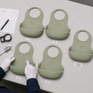
During sample review, it is useful to check whether logo appearance remains stable across different cavities and production runs.
Should Color and Logo Design Be Evaluated Together?
Yes.
Color can affect how visible the logo looks.
A logo on a light silicone product may appear softer.
A logo on a darker product may appear stronger due to shadow contrast.
The same embossed or debossed feature may therefore look different depending on:
- color tone
- surface gloss
- surrounding texture
- product curvature
- ambient lighting
For retail products, branding approval should ideally be based on the final material color—not only on a neutral trial color.
This helps avoid surprises after bulk production.
What Should Buyers Confirm Before Final Logo Approval?
Before final approval, buyers should confirm more than just logo artwork.
A practical review checklist includes:
- logo version used for molding
- embossed or debossed style
- location on the product
- logo size
- stroke thickness
- spacing readability
- depth and edge clarity
- surrounding surface finish
- distance from parting line
- cavity-to-cavity consistency
- appearance after trimming
- appearance in final product color
This review reduces the risk of approving branding that looks good only in concept but performs poorly in production.
How LYA Silicone Supports OEM Logo Development
LYA Silicone supports OEM and ODM development for baby, pet, outdoor and educational silicone products.
For logo-sensitive projects, support may include:
- product structure review
- logo placement evaluation
- embossed and debossed feasibility review
- moldability assessment
- sample comparison
- texture and appearance review
- cavity consistency checking
- final production validation
The purpose is not just to put a mark on the product.
The goal is to make sure the brand detail remains clear, attractive and stable during real production.
Silicone Logo Design Checklist
| Item | What Should Be Confirmed |
|---|---|
| Logo style | Embossed or debossed selected appropriately |
| Position | Visible and structurally suitable |
| Size | Large enough for clear molding |
| Stroke thickness | Not too thin for silicone molding |
| Surface | Logo area compatible with finish or texture |
| Parting line | Logo kept away from split-sensitive zones if possible |
| Product function | Logo does not interfere with use area |
| Color | Final appearance checked in production color |
| Multi-cavity performance | Logo compared across cavities |
| Appearance approval | Final molded sample approved before mass production |
Frequently Asked Questions
Is an embossed logo always more premium?
Not always.
An embossed logo is more visually prominent, but a debossed logo may look cleaner and more refined depending on the product design.
Can any printed logo file be used directly for silicone molding?
Not necessarily.
Some printed logos need simplification before they can mold clearly in silicone.
Should the logo be placed in the center of the product?
Only if the center is visually and structurally suitable. In some products, a corner or upper visible area works better.
Can texture make a logo harder to read?
Yes.
A heavy or uneven surface texture can reduce branding clarity, especially for small or shallow logos.
Why does the logo look different on different samples?
Possible causes include cavity differences, surface finish variation, trimming condition or the position of the logo on the product.
Should logo approval be done before mass production?
Yes.
The final logo should be approved on actual molded samples, ideally in the final product color and surface finish.
Clean Branding Starts With Manufacturable Logo Design
A successful logo on a silicone product is not only a graphic decision.
It is a product-development decision.
To achieve clean branding and repeatable quality, buyers should evaluate:
- logo style
- logo size
- logo position
- surface finish
- parting-line relationship
- cavity consistency
- final color appearance
When branding is reviewed early, the final product is more likely to meet both visual and production expectations.
If you are developing a branded silicone product, send LYA Silicone your logo file, product drawing, target color and estimated quantity for engineering review.